Here is the creative process for One Hundred Years of Solitude (Penguin Random House Grupo Editorial, Spain) an illustrated edition that celebrates the 50th anniversary of this novel written by Gabriel García Márquez. The typography of the book, Enrico, was designed by Gonzalo García Barcha, son of the author. The publishing team behind this project is Nora Grosse (Design and Art Direction), Marta Borrell (Art Direction) and Claudio López de Lamadrid (Editor).
/ A continuación, el proceso creativo para Cien Años de Soledad (Penguin Random House Grupo Editorial, España), edición ilustrada que celebra los 50 años de esta obra escrita por Gabriel García Márquez. En este proyecto también participó Gonzalo García Barcha, hijo del escritor, quien diseñó la fuente tipográfica del libro, llamada Enrico. Este proyecto también fue integrado por Nora Grosse (diseño y dirección de arte), Marta Borrell (dirección de arte), Claudio López de Lamadrid (edición).
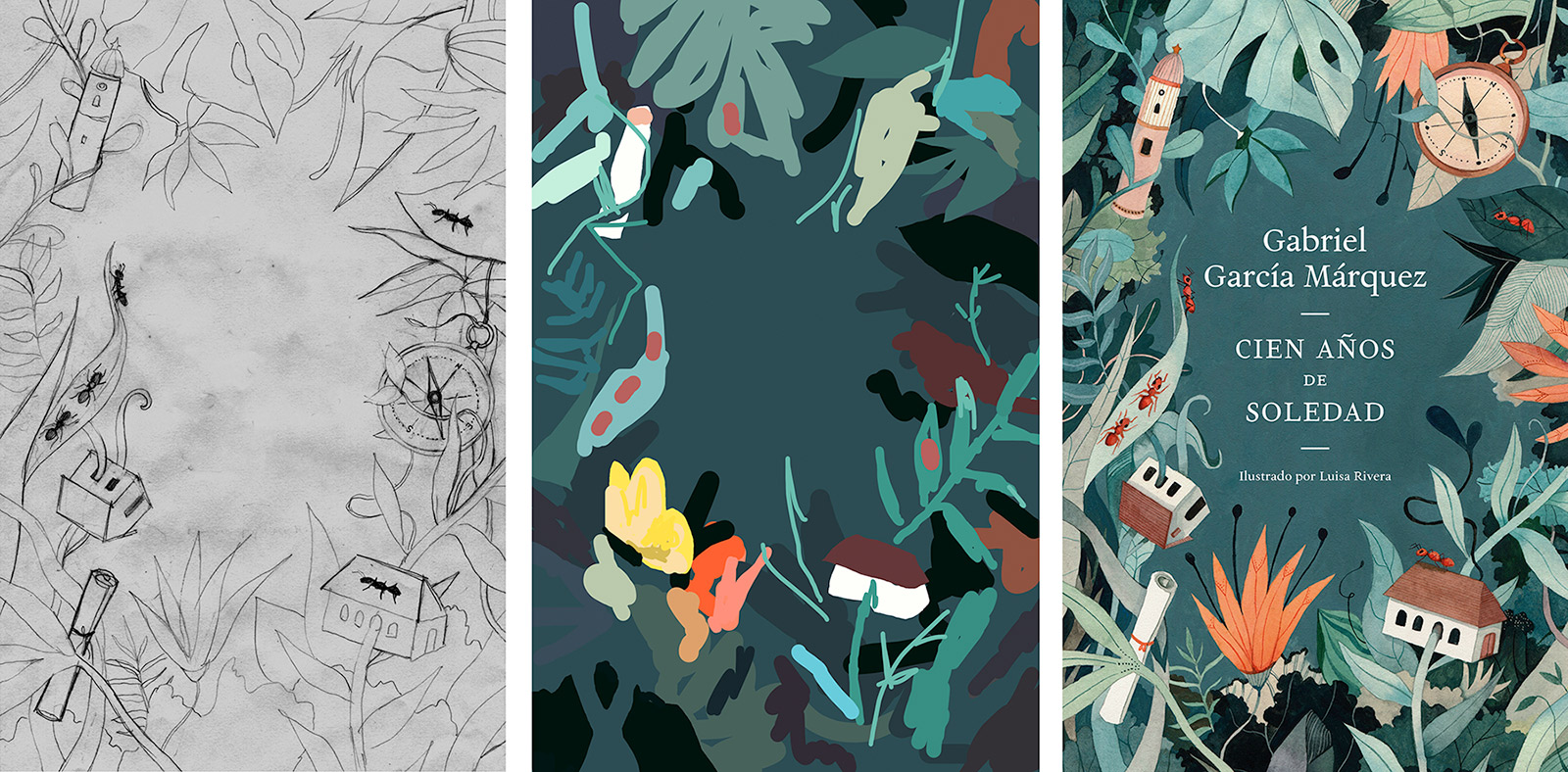
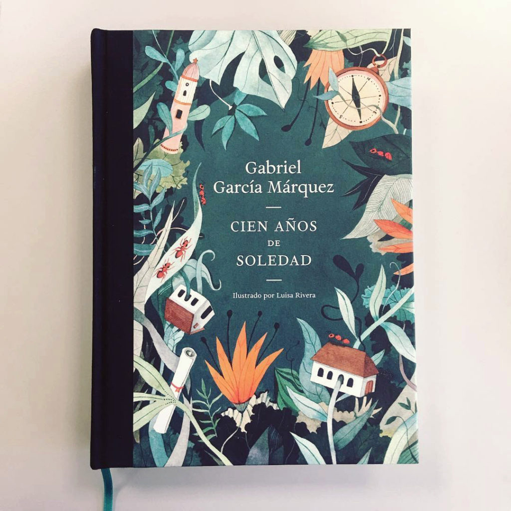
Process behind the book cover, including the color palette:
/ El proceso detrás de la portada del libro, incluyendo la paleta de color:
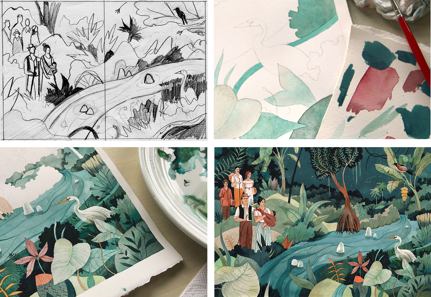
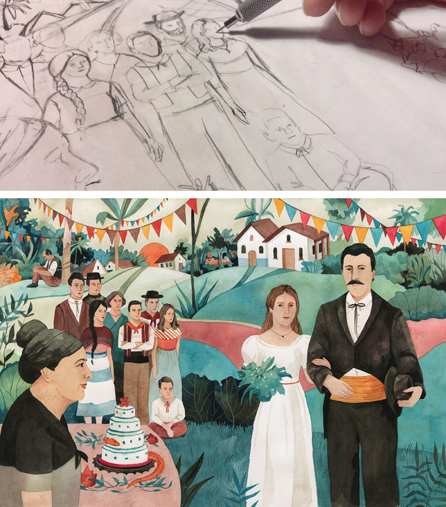
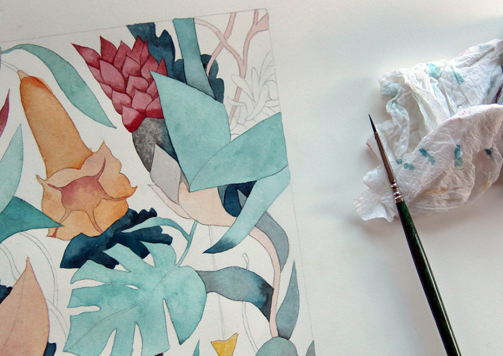
From sketch to final, one of the illustrations from the book:
/ De boceto a pintura final, una de las ilustraciones del libro:
In the process, I studied the descriptions because, although Macondo is a fictional and almost mythological place, the author gives certain geographical clues: it’s located to the west of Riohacha, swamps, wetlands. At the same time, I wanted to avoid preconceived ideas, which is difficult when working with a book that is so deeply rooted in our culture. For that, I let Gabo guide me: through interviews, reports, and readings, I was able to perceive his personal interest on the story. As I illustrated, I repeated over and over again the speech he gave upon receiving the Nobel Prize in 1982 and also more informal interviews.
/ En el proceso estudié las descripciones porque, si bien Macondo es lugar ficticio y casi mitológico, el autor da ciertas pistas geográficas: está al oeste de Riohacha, las ciénagas, los pantanos. Paralelamente, quería evitar ideas preconcebidas, lo cual es difícil cuando se trabaja con una obra que está tan arraigada en la cultura. Para ello, dejé que Gabo me guiara: a través de entrevistas, reportajes, y lecturas pude percibir el interés personal tras la historia. Mientras ilustraba, repetí una y otra vez el discurso que dio al recibir el Premio Nobel en 1982 y también entrevistas más informales.
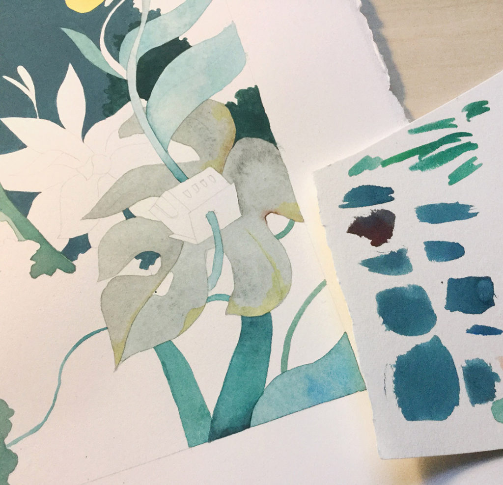
We thought a lot about the color palette and did several proofs beforehand. A unifying palette that would interlace the illustrations was the chosen one. In terms of color, we wanted something that could reflect the descriptions but adding that strange touch, typical of magical realism. In this genre the strange is expressed as an everyday occurrence, and the illustrations would convey that idea.
/ Pensamos mucho en la paleta de colores e hicimos varias pruebas antes de empezar. Optamos por una paleta unificadora que entrelazaría las ilustraciones. En términos de colorido, queríamos algo que reflejara las descripciones de los lugares pero añadiendo ese toque extraño, propio del realismo mágico. En este género lo extraño se expresa como un elemento cotidiano, y las ilustraciones recogerían esa idea.
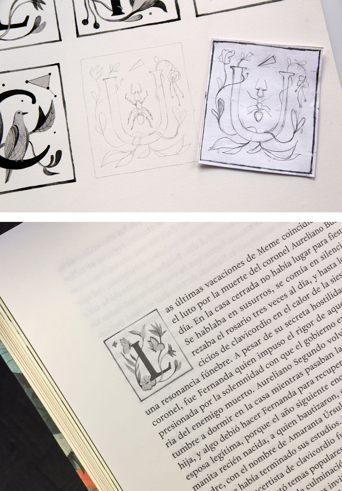
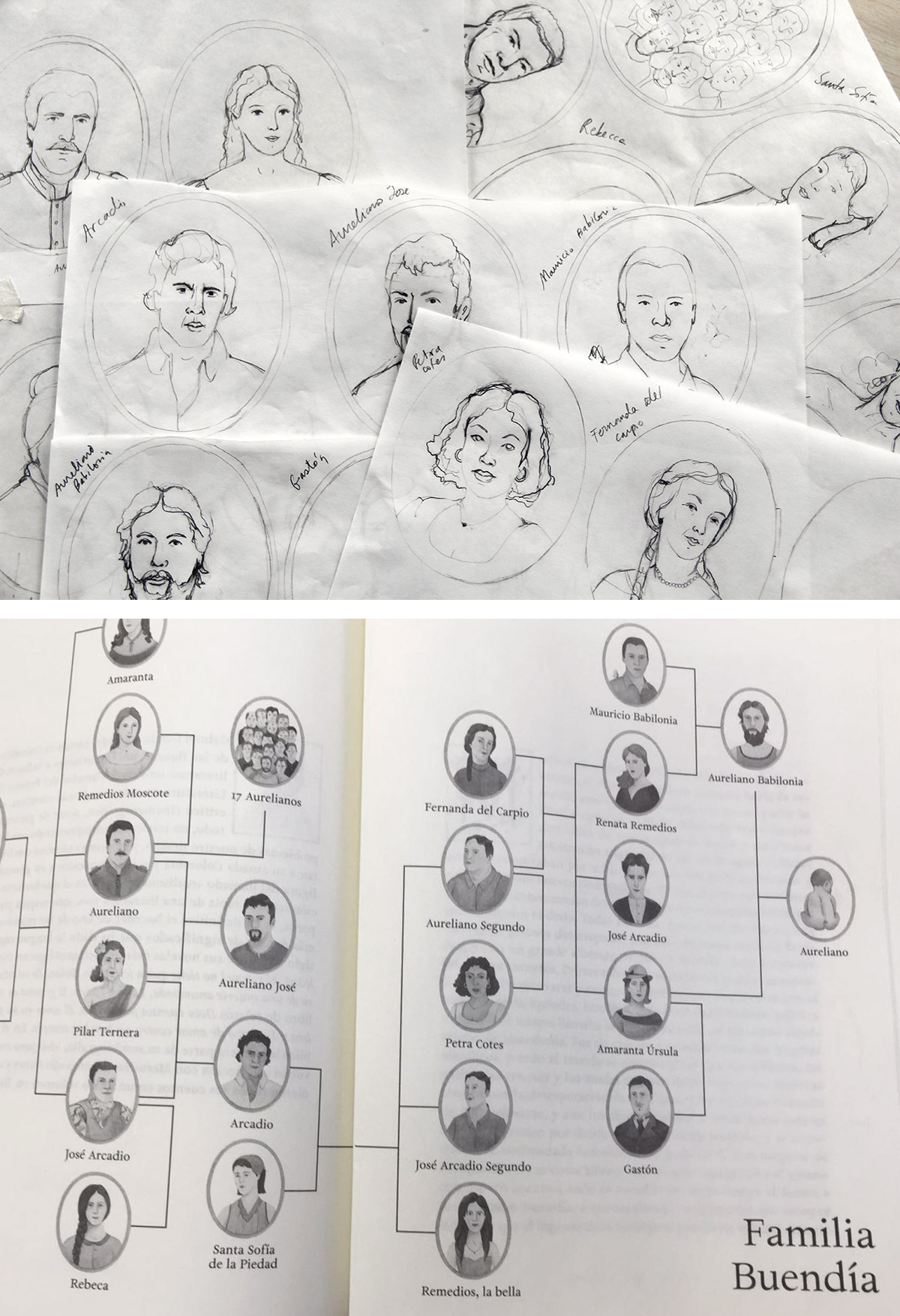
The book is composed of front and back covers, endpapers, capital letters for each chapter, a family tree, and interior illustrations. As a special touch, die-cut forms were added to the pages, which evoke the deluge, the golden fish, and so many other things in story.
/ El libro está compuesto por las cubiertas, las guardas, capitulares para cada capítulo, un árbol genealógico, e ilustraciones interiores. Como un toque especial, se añadieron formas troqueladas en las páginas, las cuales evocan el diluvio y los pescaditos de oro que se mencionan en la novela.